33 Decision Trees
One of our favorite machine learning algorithms is decision trees. They are not the most complex models, but they are quite intuitive. A single decision tree generally doesn’t have great “out of the box” model performance, and even with considerable model tuning they are unlikely to perform as well as other approaches. They do, however, form the building blocks for more complicated models that do have high out-of-the-box model performance and can produce state-of-the-art level predictions.
Decision trees are non-parametric, meaning they do not make any assumptions about the underlying data generating process. By contrast, models like linear regression assume that the underlying data were generated by a standard normal distribution (and, if this is not the case, the model will result is systematic biases - although we can also use transformations and other strategies to help; see Feature Engineering). Note that assuming an underlying data generating distribution is not a weakness of linear regression - often it’s a tenable assumption and can regularly lead to better model performance, if the assumption holds. But decision trees do not require that you make any such assumptions, which is particularly helpful when it’s difficult to assume a specific underlying data generating distribution.
At their core, decision trees work by splitting the features into a series of yes/no decisions. These splits divide the feature space into a series of non-overlapping regions, where the cases are similar in each region. To understand how a given prediction is made, one simply “follows” the splits of the tree (a branch) to the terminal node (the final prediction). This splitting continues until a specified criterion is met.
33.0.1 A simple decision tree
Initially, we think it’s easiest to think about decision trees through a classification lens. One of the most common example datasets for decision trees is the titanic dataset, which includes information on passengers aboard the titanic. The data look like this
Imagine we wanted to create a model that would predict if passengers aboard the titanic survived. A decision tree model might look something like this.
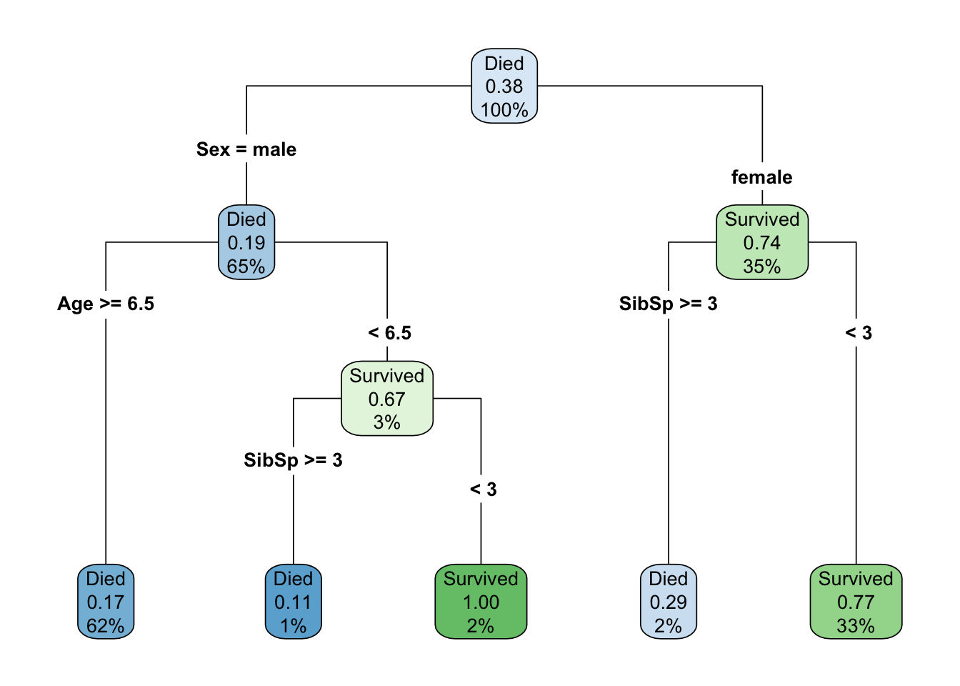
where Sibsp indicates the number of siblings/spouses onboard with the passenger.
Let’s talk about vocabulary here for a bit (see Definitions table below). In the above, there is a node at the top that provides us some descriptive statistics - namely that when there have been no splits on any features (we have 100% of the sample), approximately 38% of passengers survived. But the root node, the first feature we split on, is the sex of the passenger, which in this case is a binary indicator with two levels: male and female. Approximately 65% of all passengers were coded as male, while the remaining 35% were coded as female. Of those that were coded male, about 19% survived, while approximately 74% of those coded female survived. These are different branches of the tree. Each node is then split again on an internal node, but the feature that optimally splits these nodes is different. For passengers coded female, we use the number of siblings/spouses, with an optimal cut being three. Those with three or fewer would be predicted to survive, while those with two or less would be not be predicted to survive. Note that these are the final predictions, or the terminal nodes for this branch. Females who with three or fewer siblings/spouses represent 33% of the total sample, of which 77% survived (as predicted by the terminal node), while females with three or more siblings/spouses represent 2% of the total sample, of which 29% survived (these passengers would not be predicted to survive).
For male passengers, note that the first internal node splits first on age, because this is the more important feature for these passengers. Those who were six and a half or older are immediately predicted to not survive. This group represents 62% of the total sample, with only a 17% survival rate. However, for passengers coded male who were younger than 6.5, there was a small amount of additional information in the siblings/spouses feature. Passengers with three or more siblings/spouses would not be predicted to survive (representing 1% of the total sample, and an 11% survival rate) while those with fewer than three sibling/spouses would be predicted to survive (and all such passengers did actually survive, representing 2% of the total sample).
Note that in this example, the optimal split for siblings/spouses happened to be the same in both branches, but this is a bit of coincidence. It’s possible there’s something important about this number, but the split value does not have to be the same, and in fact the same feature can be used multiple times for multiple splits, each with a different value, while splitting on internal nodes.
For classification problems, like the above, the predicted class in the terminal node is determined by the most frequent class (the mode). For regression problems, the prediction is determined by the mean of the outcome for all cases in the given terminal node.
| Term | Description |
|---|---|
| Root node | The top feature in a decision tree. The column that has the first split |
| Internal node | A grouping within the tree between the root node and the terminal node, e.g., all passengers coded female. |
| Terminal node or Terminal leaf | The final node/leaf of a decision tree. The prediction grouping. |
| Branch | The prediction “flow” of the tree. One often “follows” a branch to a terminal node. |
| Split | A threshold value for numeric features, or a classification separation rule for categorical features, that optimally separates the sample according to the outcome |
33.1 Determining optimal splits
Regression trees work by optimally splitting each node until some criterion is met. But how do we determine what’s optimal? We use an objective function. For regression problems, this usually the sum of the squared errors, defined by
\[ \Sigma_{R1}(y_i - c_1)^2 + \Sigma_{R2}(y_i - c_2)^2 \]
where \(c\) is the prediction (mean of cases in the region), which starts as a constant and is updated, and \(R\) is the region. The algorithm searches through every possible split for every possible feature to identify the split that minimizes the sum of the squared errors.
For classification problems, the Gini impurity index is most common. Note that this is not the same index that is regularly used in spatial demography and similar fields to estimate inequality. Confusingly, both terms are referred to as the Gini index (with the latter also being referred to as the Gini coefficient or Gini ratio), but they are entirely separate.
For a two-class situation, the Gini impurity index, used in decision trees, is defined by
\[ D_i = 1 - P(c_1)^2 - P(c_2)^2 \]
where where \(P(c_1)\) and \(P(c_2)\) are the probabilities of being in Class 1 or 2, respectively, for node \(i\). This formula can be generalized to a multiclass situation by
\[ D_i = 1 - \Sigma(p_i)^2 \]
In either case, when \(D = 0\), the node is “pure” and the classification is perfect. When \(D = 0.5\), the node is random (flip a coin). As an example, consider a terminal node with 75% of cases in one class. The Gini impurity index would be estimated as
\[ \begin{aligned} D &= 1 - (0.75^2 + 0.25^2) \\\ D &= 1 - (0.5625 + 0.0625) \\\ D &= 1 - 0.625 \\\ D &= 0.375 \end{aligned} \]
As the proportion in one class goes up, the value of \(D\) goes down. Similar to regression problems, the searches through all possible features to find the optimal split that minimizes \(D\).
Regardless of whether the decision tree is built to solve a regression or classification problem, the algorithm is built recursively, with new optimal splits determined from previous splits. This “top down” approach is one example of a greedy algorithm, in which a series of localized optimal decisions are made. In other words, the optimal split is determined for each node. There is no going backwards to check if a different combination of features and splits would lead to better performance.
33.2 Visualizing decision trees
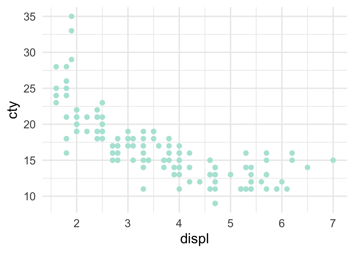
The decision tree itself is often helpful for understanding how predictions are made. Scatterplots can also be helpful in terms of viewing how the predictor space is being partitioned. For example, imagine we are fitting a model to the following data
In this case, we only have a single predictor variable, displ, but we can split on that variable multiple times. Let’s start with a single split, and we’ll build from there. The decision tree for a single split model (also called a “stump”) looks like this
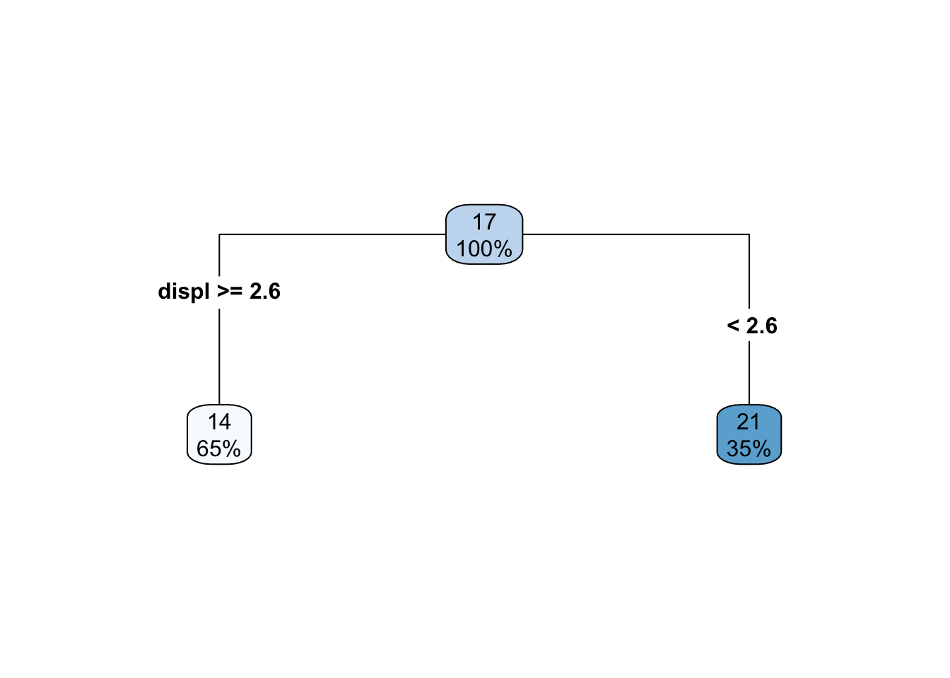
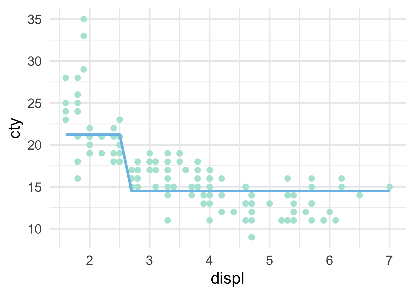
So we are just splitting based on whether displ is greater than or equal to 2.6. How does this look in the scatterplot? Well, if the displ >= 2.6, it’s a horizontal line at 14, and if displ <= 2.6, it’s a horizontal line at 21.
What if we add one additional split? Well then the decision tree looks like this
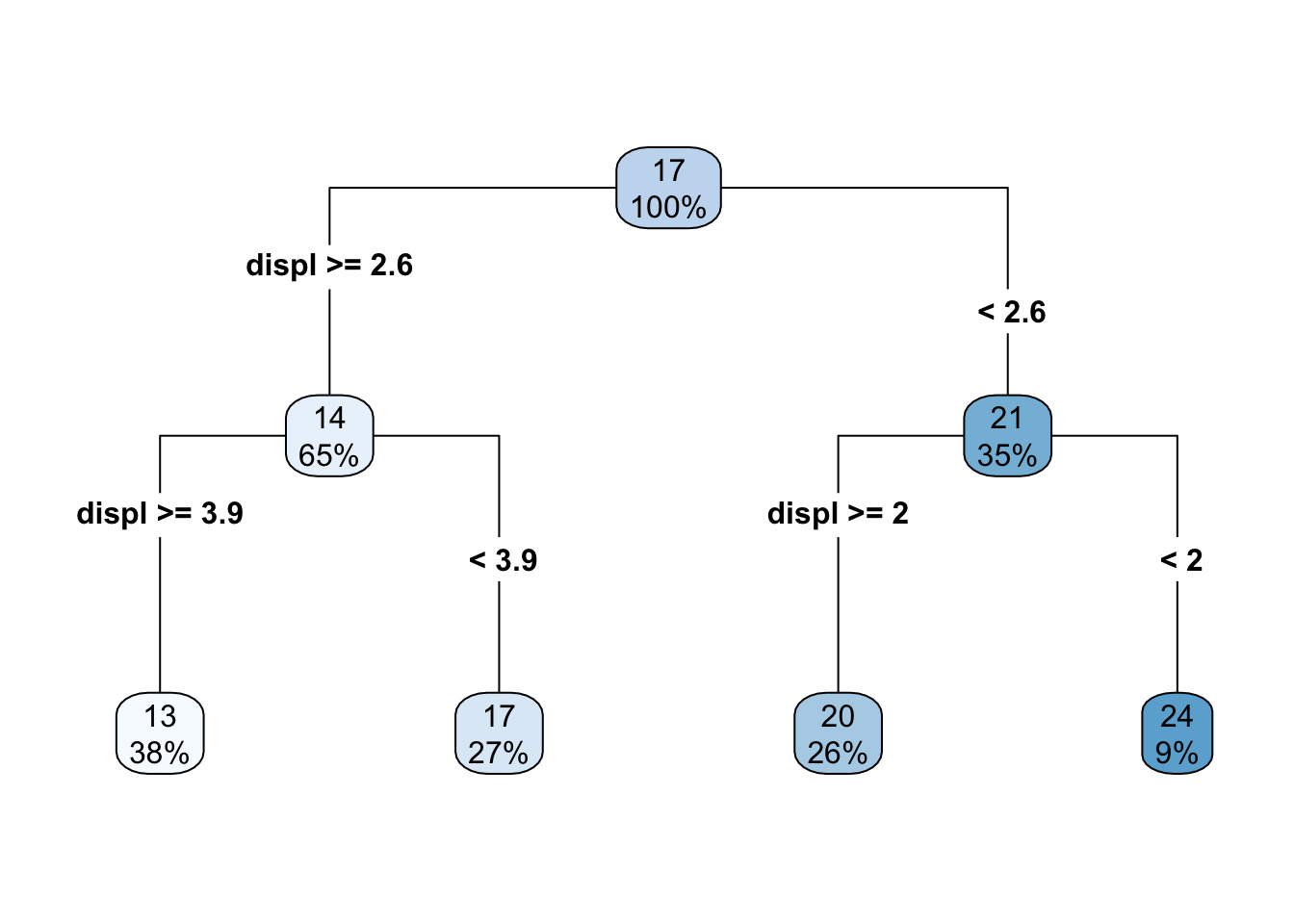
and the scatterplot looks like this
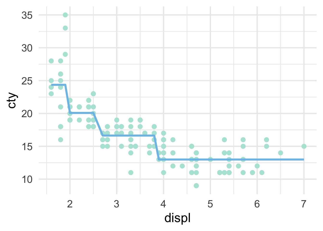
As the number of splits increases, the fit to the data increases. However, the model can also quickly overfit and not generalize to new data well, which is why a single decision tree is often not the most performant model.
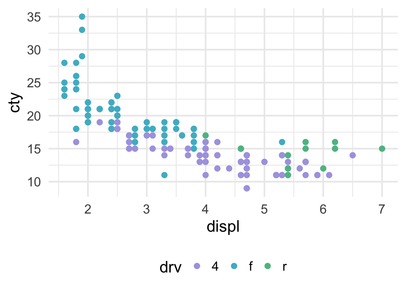
We can visualize classification problems with decision trees using scatterplots as well, as long as there are two continuous predictor variables. Sticking with our mpg dataset, let’s say we wanted to predict the drivetrain: front-wheel drive, rear-wheel drive, or four-wheel drive. The scatterplot would then look like this (assuming we’re now using displ and cty as predictor variables).
How does the predictor space get divided up? Let’s try first with a stump model. The tree looks like this
drv_stump <- rpart(drv ~ displ + cty, mpg,
control = list(maxdepth = 1))
rpart.plot(drv_stump, type = 4)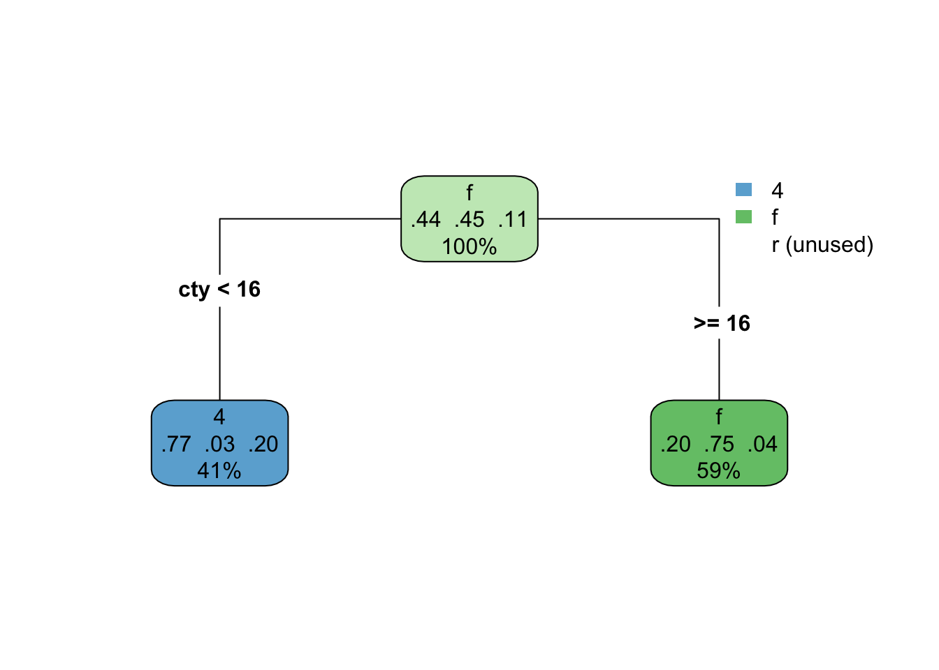
This model isn’t doing too well. It looks like we’re not capturing any of the rear-wheel drive cases. That of course makes sense, because we only have one split, so we can’t predict three different classes. Here’s what it looks like with the scatterplot
NOTE: There’s a bug (I think) in the package that currently means I have to flip the axes here. We should come back and change it when it’s fixed. See here: https://github.com/grantmcdermott/parttree/issues/5
library(parttree)
ggplot(mpg, aes(cty, displ)) +
geom_parttree(aes(fill = drv),
data = drv_stump,
alpha = 0.4,
flipaxes = TRUE) +
geom_point(aes(color = drv))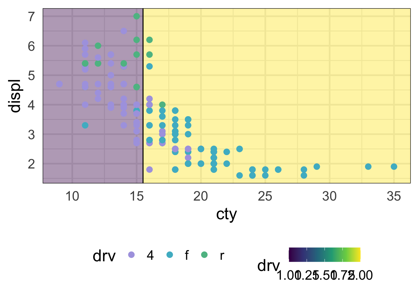
And what if we go with a more complicated model? Say, 3 splits? Then the tree looks like this.
drv_threesplits <- rpart(drv ~ displ + cty, mpg,
control = list(maxdepth = 3))
rpart.plot(drv_threesplits, type = 4)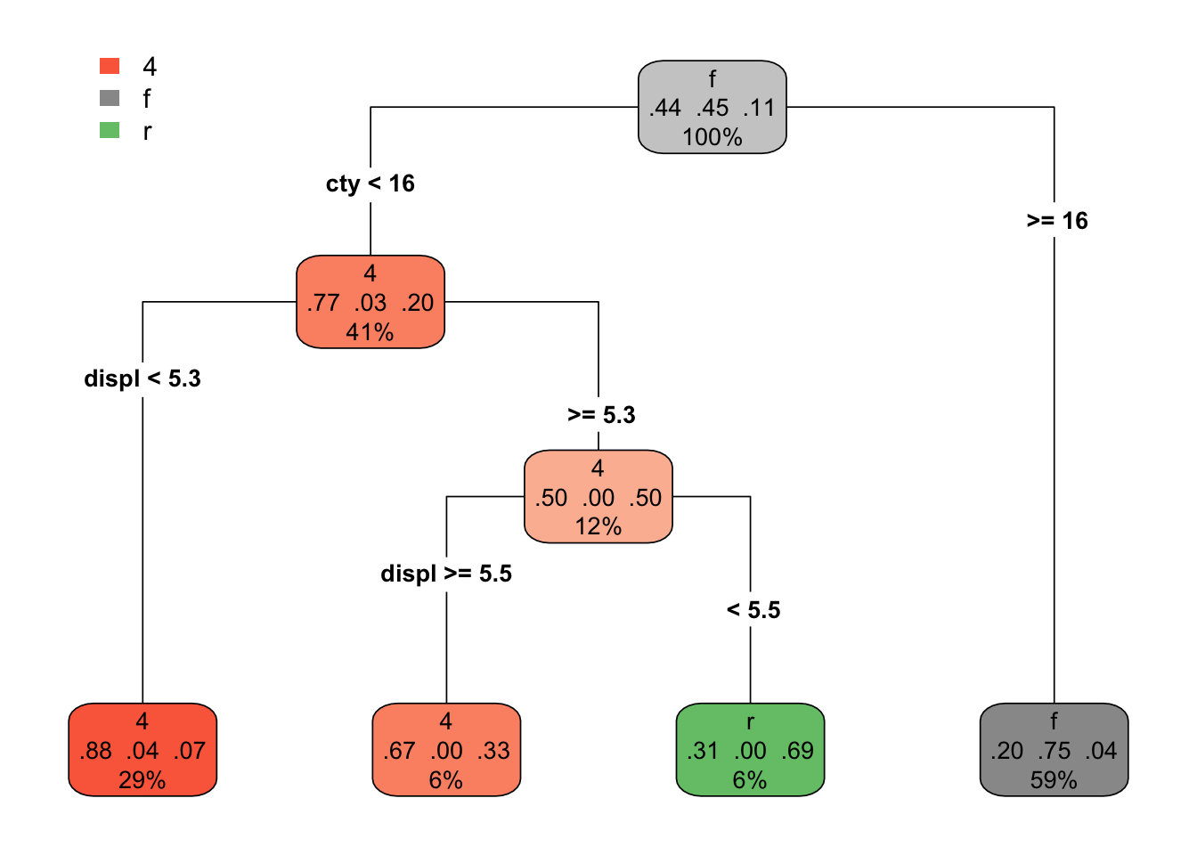
And our predictor space can now be divided up better.
ggplot(mpg, aes(displ, cty)) +
geom_parttree(aes(fill = drv),
data = drv_threesplits,
alpha = 0.4,
flipaxes = TRUE) +
geom_point(aes(color = drv))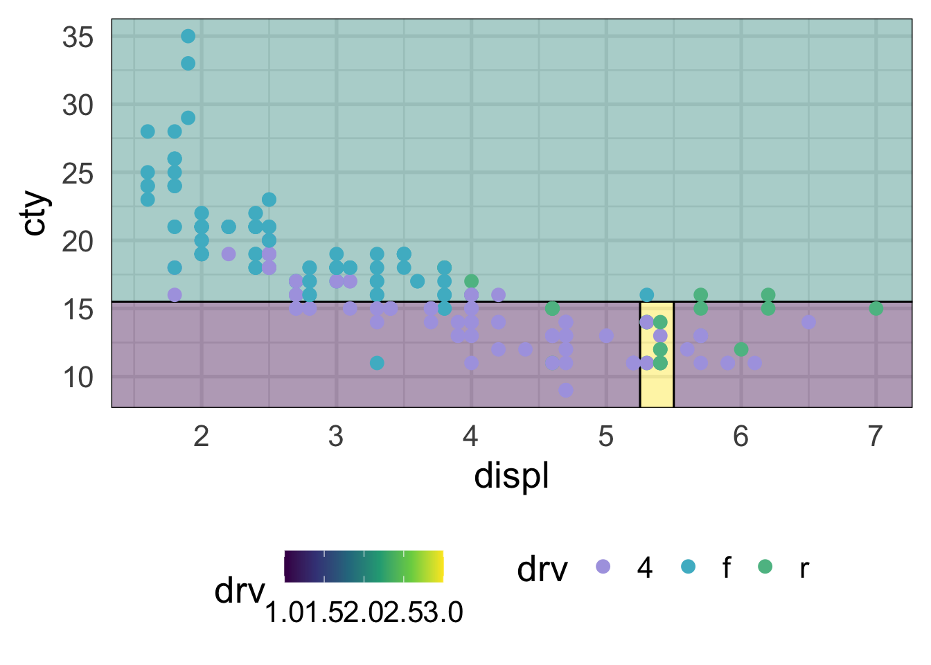
This looks considerably better and, although we still have some misclassification, that’s ultimately probably a good thing because we don’t want to start to overfit to our training data. Decision trees, like all models, should balance the bias-variance tradeoff. They are flexible and make few assumptions about the data, but that can also quickly lead to overfitting and poor generalizations to new data.
33.3 Fitting a decision tree
As an applied example, let’s fit a decision tree model to data from the 2019 Data Science Bowl from Kaggle. These data come from PBS KIDS on data from an educational gaming app called Measure Up!. You can actually still submit to this competition (as of the time of this writing) if you’d like to see how performant your model is. The objective is to fit a model to predict kiddo’s (ages 3-5) scores on an in-game assessment.
The outcome is accuracy_group, which is an ordered categorical variable ranging from 0-4. See the Kaggle description of the data for more information.
33.3.1 Load the data
First, we need to read in the train.csv and train_labels.csv data. Note that I’ve removed the event_data column, which includes JSON data on event_count, event_code, and game_time, which are already represented as columns in train.csv. I’ve also sampled only read in the first 10,000 rows of the data so that things will run more quickly.
After joining the training data with the labels, our full training dataset look like this
Next we’ll create our initial split, pull our training data, and create our \(k\)-fold cross-validation data object.
Let’s now create a basic recipe for this dataset. In this case, we won’t spend much time on the feature engineering (because we’re focusing on the modeling). So we’ll just use the recipe to specify the formula.
And finally, we’ll specify the type of model we want to fit. Because we’re using {tidymodels} metapackage, and the {parsnip} package in particular for specifying our model, the code setup is essentially equivalent to what we’ve seen in the past. Rather than specifying, say, lineary_regression(), however, we just use decision_tree(). We then specify the engine to estimate the model, which will be {rpart}, and set our mode (classification).
And finally, we can estimate the model! Let’s use fit_resamples() so we can get an idea of how the model performs using the default settings. Notice I’ve added timings here so we have a sense of how long each takes (which is a while).
## 21.443 sec elapsedAs we’ve seen before, the code above fits the decision tree model with the default parameters to each of the 10 folds, and evaluates the predictions from that model against the left out set.
Let’s look at our model performance:
## # A tibble: 2 x 5
## .metric .estimator mean n std_err
## <chr> <chr> <dbl> <int> <dbl>
## 1 accuracy multiclass 0.527 10 0.00231
## 2 roc_auc hand_till 0.670 10 0.00160Not too bad, but given that we haven’t tuned the model at all, it’s likely we can improve on this. To learn more about these models and how much they differ across folds, we probably want to actually inspect the splits (e.g., how many) and (at least) the root nodes. Unfortunatley we can’t do that with the dt_default object because, by default, the model object is not saved (which generally makes sense from an efficiency and storage perspective). Let’s re-run this, but this time ask it to also save the model object.
tic()
dt_default2 <- fit_resamples(
dt_mod,
preprocessor = rec,
resamples = cv,
control = control_resamples(extract = function(x) extract_model(x))
)
toc()## 20.914 sec elapsedWe can visualize the model using the {rpart.plot} package. Actually pulling out the model is a bit difficult, because it’s pretty deeply nested, but it’s not horrible. Let’s write a function to do so.
And now we’ll loop through the full list of extract to get a list of just the models.
And now we can easily look at any of the models. Here’s the tree for the first.
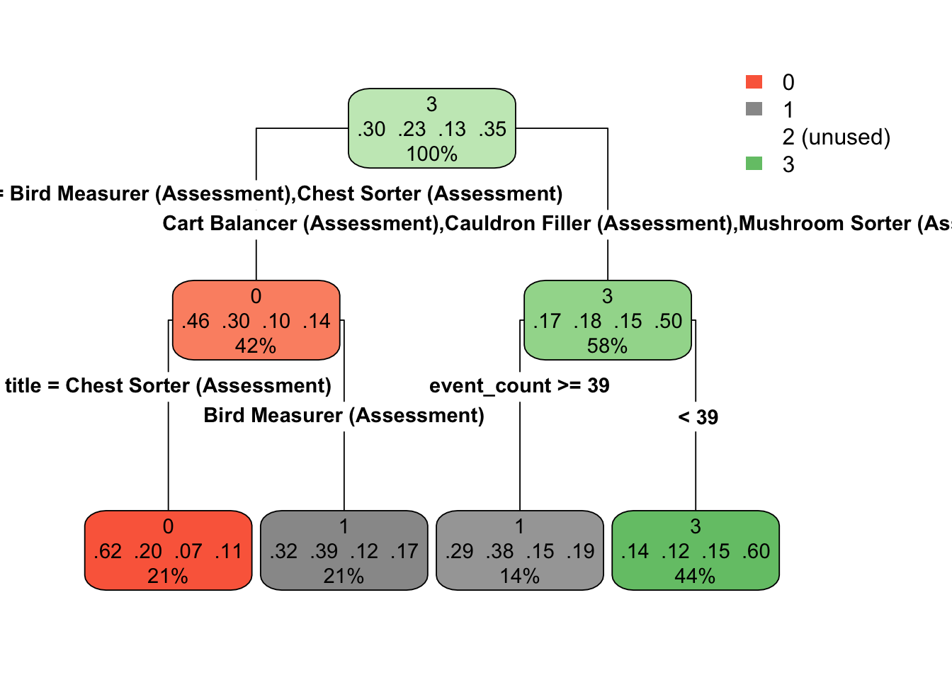
If you’re running this with me, you’ll notice that you get a warning here about not being able to retrieve the data used to build the model. This is generally not a big deal for our purposes. I’ve also included the optional type argument, which just changes the way the tree is drawn a bit.
By comparison, let’s look at the tree for the third fold.

Notice that the models are quite different. This show the potential for high variability with decision trees (while also potentially having low bias).
33.4 Tuning decision trees
In the previous section, we fit a model with the default settings. Can we improve performance by changing these? Let’s find out! But first, what might we change?
33.4.1 Decision tree hyperparamters
Decision trees have three hyperparamters as shown below. These are standard hyperparameters and are implemented in {rpart}, the engine we used for fitting decision tree models in the previous section. Alternative implementations may have slightly different hyperparameters (see the documentation for parsnip::decision_tree() details on other engines).
| Hyperparameter | Function | Description |
|---|---|---|
| Cost Complexity | cost_complexity() |
A regularization term that introduces a penalty to the objective function and controls the amount of pruning. |
| Tree depth | tree_depth() |
The maximum depth the tree should be grown |
| Minimum \(n\) | min_n() |
The minimum number of observations that must be present in a terminal node. |
Perhaps the most important hyperparameter is the cost complexity parameter, which is a regularization parameter that penalizes the objective function by model complexity. In other words, the deeper the tree, the higher the penalty. The cost complexity parameter is typically denoted \(\alpha\), and penalizes the sum of squared errors by
\[ SSE + \alpha |T| \]
where \(T\) is the number of terminal nodes. Any value can be use for alpha, but typical values are less that 0.1. The cost complexity helps control model complexity through a process called pruning, in which a decision tree is first grown very deep, and then pruned back to a smaller subtree. The tree is initially grown just like any standard decision tree, but it is pruned to the subtree that optimizes the penalized objective function above. Different values of \(\alpha\) will, of course, lead to different subtrees. The best values are typically determined via grid search via cross validation. Larger cost complexity values will result in smaller trees, while smaller values will result in more complex trees.
Note that, similar to penalized regression, if you are using cost complexity to prune a tree it is important that all features are placed on the same scale (normalized) so the scale of the feature doesn’t influence the penalty.
The tree depth and minimum \(n\) are a more straightforward methods to control model complexity. The tree depth is just the maximum depth to which a tree can be grown (maximum number of splits). The minimum \(n\) controls the splitting criteria. A node cannot be split further once the \(n\) within that node is below the minimum specified.
33.4.2 Conducting the grid search
Let’s tune our model using cost_complexity() and min_n() and let the depth be controlled by these parameters.
First, we’ll modify our model from before to set the parameters to tune.
Next, we’ll set up our grid. We can use helper functions from the {dials} package (part of tidymodels) to help us come up with reasonable values. Let’s use a regular grid with 10 possible values for cost complexity and 5 possible values for the minimum \(n\).
Let’s see what the space we’rd evaluating actually looks like for our hyperparamters.
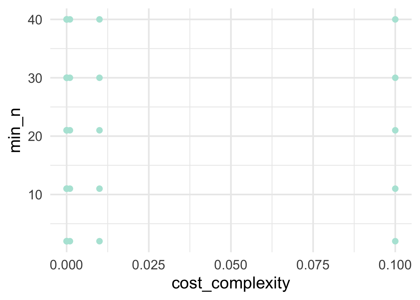
As we can see, there’s a big gap in cost complexity, so we’ll want to be careful when we investigate the optimal values there.
Now let’s actually conduct the search. I have again included timing here so you can see how long it took for me to run on my local computer (which is a decent amount of time).
The below took about 20 minutes to run on a local computer.
First let’s look at our results by hyperparameter. We can use collect_metrics to get a summary (mean) of the metrics we set (which we didn’t, so we’ll get the defaults, which in this case are roc_auc and accuracy) across folds. You can optionally get te results by fold (no summarizing) by specifying summarize = FALSE.
## # A tibble: 100 x 8
## cost_complexity min_n .metric .estimator mean n std_err .config
## <dbl> <int> <chr> <chr> <dbl> <int> <dbl> <chr>
## 1 0.0000000001 2 accuracy multiclass 0.466 10 0.00196 Model01
## 2 0.0000000001 2 roc_auc hand_till 0.607 10 0.00126 Model01
## 3 0.000000001 2 accuracy multiclass 0.466 10 0.00196 Model02
## 4 0.000000001 2 roc_auc hand_till 0.607 10 0.00126 Model02
## 5 0.00000001 2 accuracy multiclass 0.466 10 0.00196 Model03
## 6 0.00000001 2 roc_auc hand_till 0.607 10 0.00126 Model03
## 7 0.0000001 2 accuracy multiclass 0.466 10 0.00196 Model04
## 8 0.0000001 2 roc_auc hand_till 0.607 10 0.00126 Model04
## 9 0.000001 2 accuracy multiclass 0.466 10 0.00196 Model05
## 10 0.000001 2 roc_auc hand_till 0.607 10 0.00126 Model05
## # … with 90 more rowsTo get an idea of how things are performing, let’s look at our two hyperparameters with roc_auc as our metric. This is a metric we want to maximize, with a value of 1.0 indicating perfect predictions.
dt_tune_metrics %>%
filter(.metric == "roc_auc") %>%
ggplot(aes(cost_complexity, mean)) +
geom_point() +
facet_wrap(~min_n)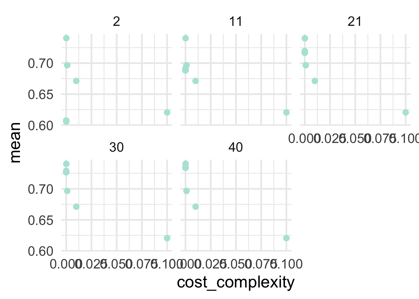
So generally it’s looking like lower values of of cost complexity are leading to better performing models, and the minimum sample size for a terminal node is looking best at 21 or 30. Let’s look at our best models in a more tabular form. This time we’ll use show_best to show our best hyperparameter combinations.
## # A tibble: 5 x 8
## cost_complexity min_n .metric .estimator mean n std_err .config
## <dbl> <int> <chr> <chr> <dbl> <int> <dbl> <chr>
## 1 0.0001 40 roc_auc hand_till 0.741 10 0.00167 Model47
## 2 0.0001 2 roc_auc hand_till 0.740 10 0.00185 Model07
## 3 0.0001 30 roc_auc hand_till 0.740 10 0.00164 Model37
## 4 0.0001 11 roc_auc hand_till 0.740 10 0.00186 Model17
## 5 0.0001 21 roc_auc hand_till 0.740 10 0.00169 Model27And we see a little bit different picture here. Our best model has a minimum \(n\) of 11 with a relatively higher cost complexity. But the amount this model is “better” is trivial and could easily be due to sampling variability. All of the rest of the best models have the same minimum \(n\), with the cost complexity playing essentially no role. This may lead us to consider not pruning by the cost complexity parameter at all. Let’s use all the results again to look at the minimum \(n\) a little closer. We’ll filter for a very low cost complexity.
dt_tune_metrics %>%
filter(.metric == "roc_auc" &
cost_complexity == 0.0000000001) %>%
arrange(desc(mean))## # A tibble: 5 x 8
## cost_complexity min_n .metric .estimator mean n std_err .config
## <dbl> <int> <chr> <chr> <dbl> <int> <dbl> <chr>
## 1 0.0000000001 40 roc_auc hand_till 0.734 10 0.00181 Model41
## 2 0.0000000001 30 roc_auc hand_till 0.727 10 0.00168 Model31
## 3 0.0000000001 21 roc_auc hand_till 0.717 10 0.00105 Model21
## 4 0.0000000001 11 roc_auc hand_till 0.688 10 0.00132 Model11
## 5 0.0000000001 2 roc_auc hand_till 0.607 10 0.00126 Model01Unsurprisingly, 30 is looking best for our minimum \(n\). To be sure we’ve got this right though, let’s set cost_complexity and tune just on the minimum \(n\). We know that values of 21 and 40 are both worst than 30, but let’s see if there’s any more room for optimization around there.
This shouldn’t take quite as long as our previous grid search, but on my local computer it still took about five and half minutes.
grid_min_n <- tibble(min_n = 23:37)
dt_tune2 <- dt_tune %>%
set_args(cost_complexity = 0.0000000001)
dt_tune_fit2 <- tune_grid(
dt_tune2,
preprocessor = rec,
resamples = cv,
grid = grid_min_n
)Let’s look at our best metrics now and see if we’ve made any improvements.
## # A tibble: 5 x 7
## min_n .metric .estimator mean n std_err .config
## <int> <chr> <chr> <dbl> <int> <dbl> <chr>
## 1 37 roc_auc hand_till 0.732 10 0.00164 Model15
## 2 36 roc_auc hand_till 0.732 10 0.00172 Model14
## 3 35 roc_auc hand_till 0.731 10 0.00162 Model13
## 4 34 roc_auc hand_till 0.730 10 0.00170 Model12
## 5 33 roc_auc hand_till 0.730 10 0.00166 Model11And look at that! It’s a (very) marginal improvement, but we have optimized our model a bit more.
33.4.3 Finalizing our model fit
Generally before moving to the our final fit we’d probably want to do a bit more work with the model to make sure we were confident it was really the best model we could produce. I’d be particularly interested at looking at minimum \(n\) around the 0.001 cost complexity parameter (given that the overall optimum in our original gridsearch had this value with a minimum \(n\) of 11). But for illustration purposes, let’s assume we’re ready to go (and really, decision trees don’t have a lot more tuning we can do with them, at least using the rpart engine).
First, let’s finalize our model using the best min_n we found from our grid search. We’ll use finalize_model along with select_best (rather than show_best) to set the final model parameters.
best_params <- select_best(dt_tune_fit2, metric = "roc_auc")
final_mod <- finalize_model(dt_tune2, best_params)
final_mod## Decision Tree Model Specification (classification)
##
## Main Arguments:
## cost_complexity = 1e-10
## min_n = 37
##
## Computational engine: rpartNote that the min_n is now set. If we had done any tuning with our recipe we could follow a similar process.
Next, we’re going to use our original initial_split() object to, with a single function fit our model to our full training data (rather than by fold) and make predictions on the test set, and evalute the performance of the model. We do this all throught he last_fit function.
## # Resampling results
## # Monte Carlo cross-validation (0.75/0.25) with 1 resamples
## # A tibble: 1 x 6
## splits id .metrics .notes .predictions .workflow
## <list> <chr> <list> <list> <list> <list>
## 1 <split [65K/… train/test… <tibble [2 ×… <tibble [0… <tibble [21,682… <workflo…What we get output doesn’t look terrifically helpful, but it is. It’s basically everything we need. For example, let’s look at our metrics.
## # A tibble: 2 x 3
## .metric .estimator .estimate
## <chr> <chr> <dbl>
## 1 accuracy multiclass 0.543
## 2 roc_auc hand_till 0.735unsurprisingly, our AUC is a bit lower for our test set. What if we want our predictions?
## # A tibble: 21,682 x 7
## .pred_0 .pred_1 .pred_2 .pred_3 .row .pred_class accuracy_group
## <dbl> <dbl> <dbl> <dbl> <int> <fct> <ord>
## 1 0.686 0.314 0 0 1 0 0
## 2 0.706 0.167 0.0816 0.0461 6 0 0
## 3 0.154 0.0769 0.462 0.308 7 2 3
## 4 0.0143 0.0571 0.1 0.829 9 3 3
## 5 0.12 0.09 0.06 0.73 11 3 3
## 6 0 0.737 0.175 0.0877 18 1 1
## 7 0.725 0.266 0.00917 0 28 0 0
## 8 0.511 0.216 0.144 0.129 32 0 2
## 9 0 1 0 0 36 1 1
## 10 0.286 0.476 0 0.238 47 1 1
## # … with 21,672 more rowsThis shows us the predicted probability that each case would be in each class, along with a “hard” prediction into a class, and their observed class (accuracy_group). We can use this for further visualizations and to better understand how our model makes predictions and where it is wrong. For example, let’s look at a quick heat map of the predicted class versus the observed.
counts <- predictions %>%
count(.pred_class, accuracy_group) %>%
drop_na() %>%
group_by(accuracy_group) %>%
mutate(prop = n/sum(n))
ggplot(counts, aes(.pred_class, accuracy_group)) +
geom_tile(aes(fill = prop)) +
geom_label(aes(label = round(prop, 2))) +
colorspace::scale_fill_continuous_diverging(
palette = "Blue-Red2",
mid = .25,
rev = TRUE)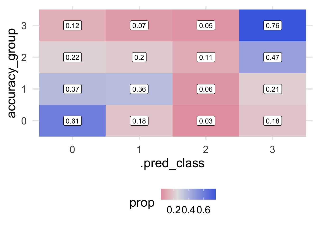
Notice that I’ve omitted NA’s here, which is less than ideal, because we have a lot of them. This is mostly because the original data themselves have so much missing data on the outcome, so it’s hard to know how well we’re actually doing with those cases. Instead, we’re just evaluating our model with the cases for which we actually have an observed outcome. The plot above shows the proportion by row. In other words, each row sums to 1.0.
We can fairly quickly see that our model has some fairly significant issues. We are doing okay predicting classes for 0 and 3 (about 75% correct, in each case) but we’re not a whole lot better than random chance leve (which would be 0.25-ish in each cell) when predicting Classes 1 and 2. It’s fairly concerning that 32% of cases that were actually Class 2 were predicted to be Class 0. We would likely want to conduct a post-mortem with these cases to see if we could understand why our model was failing in this particular direction.
Decision trees, generally, are easily interpretable and easy to communicate with stakeholders. They also make no assumptions about the data, and can be applied in a large number of situations. Unfortunately, they often suffer from rapid overfitting to the data leading to poor generalizations to unseen data. In the next chapter, we’ll build on decision trees to talk about ensemble methods, where we use multiple trees to make a single prediction.